BRAND IDENTITY
CLIENT: Mura Projects
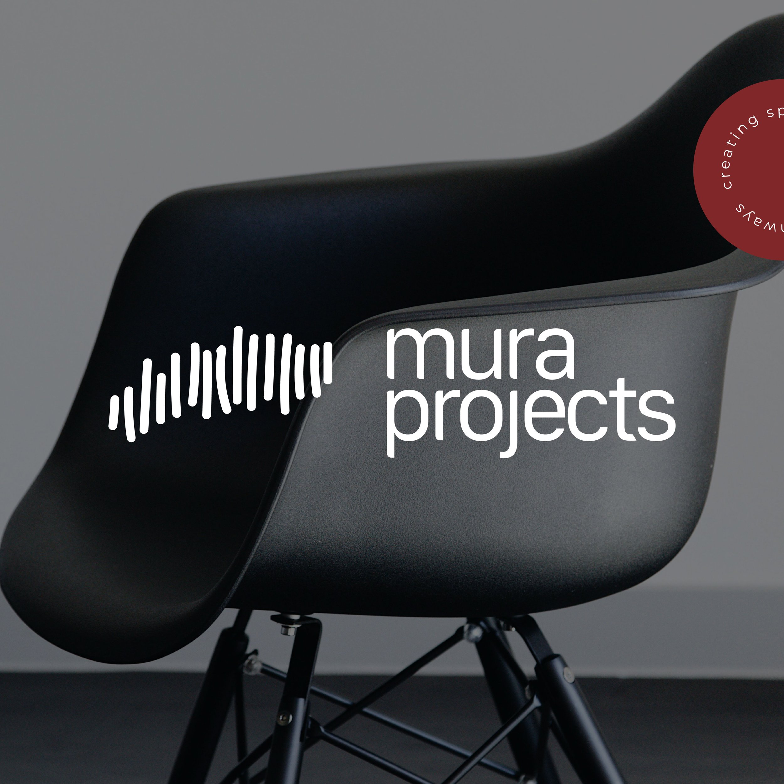
Mura is a word from the Ngunnawal language meaning "pathway".
THE BRIEF | Mura Projects is a 50% Indigenous-owned furniture provider delivering high-quality furniture and lighting packages for contract projects across Australia. Mura Projects needed a brand identity that felt true to their purpose: empowering First Nations youth through community-led engagement and culturally grounded solutions. They weren’t looking for something flashy or overly corporate—they wanted something real. A brand that spoke to their values, reflected their identity, and honoured the journey they walk alongside young people every day.
THE CHALLENGE | Create a visual identity that honoured First Nations culture while drawing inspiration from high-end architectural design. Mura Projects wanted a brand that felt rooted in Country, but also refined—minimal, sophisticated, and future-focused. It needed to feel at home alongside brands like DesignCraft and Living Edge, while staying true to the heart of Mura’s work—empowering First Nations youth through community-driven initiatives.
VISUAL DIRECTION | The brand direction is built around the meaning of ‘Mura’—pathway in Ngunnawal language. Drawing on the concept of a pathway—visualised through a series of hand-drawn lines that feel both organic and intentional. These forms echo natural elements found in Country—sand dunes, tree lines, stone ridges—and symbolise movement, progress, and interconnectedness.
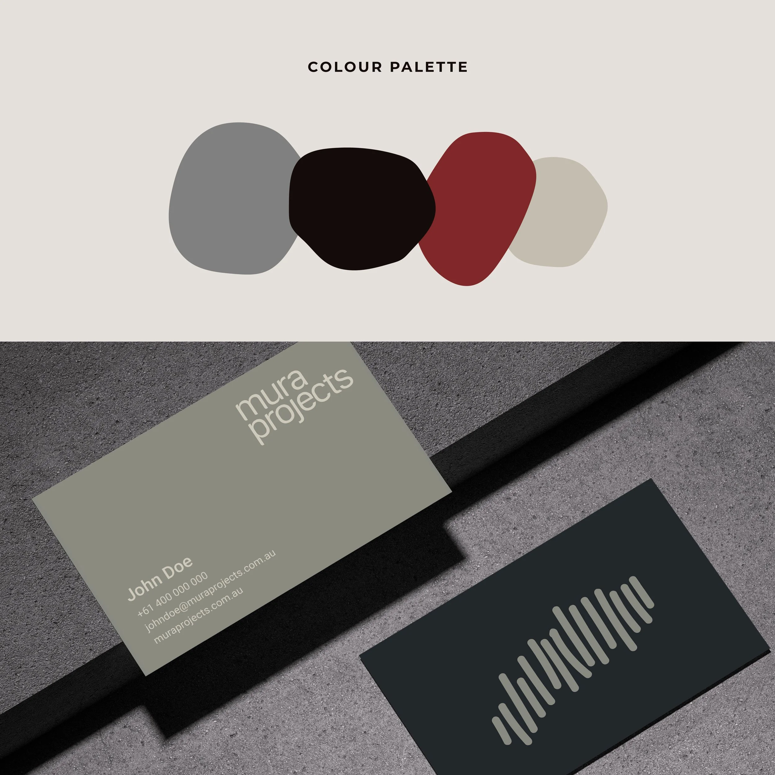
The logomark anchors the brand, while the modern, architectural typography offers contrast: clean, understated, and grounded. The colour palette reflects sustainability and craftsmanship—earthy stone, charcoal, and clay red—giving the identity a warm, sophisticated edge.